
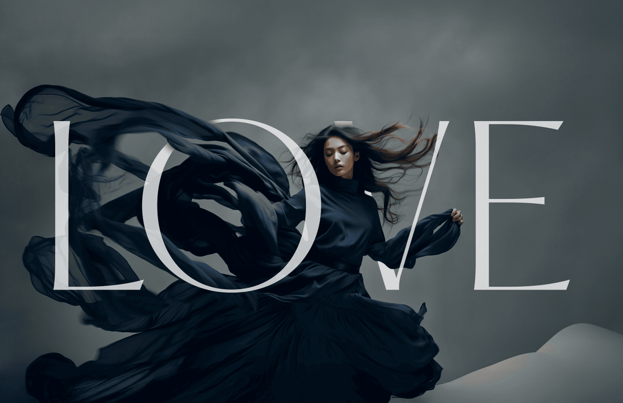
FORMA
Forma seeks a space in the cosmetic sector with a modern, futuristic look, and less cluttered than other names, in favor of ergonomics and communication.
Branding
Cosmetics
Know More
Sensory branding through form and function
Problem
Problem
Skincare lacks inclusivity and visual clarity
Mainstream cosmetic packaging often prioritizes appearance over usability, relying on overly decorative or gendered visuals. Users with visual impairments are frequently excluded from product interactions, and even sighted users face complexity instead of clarity.


Solution
Solution
A graphic system built on shape and accessibility
FORMA’s branding explores the idea of form as language—where structure, contrast, and texture guide user experience. Braille becomes more than a functional tool; it transforms into a design element that reinforces visual hierarchy and graphic identity with purpose and subtlety.


Concept
Concept
Design that simplifies, communicates, and empowers
FORMA merges graphic design, packaging, and product ergonomics into a cohesive visual system. Neutral tones, geometric balance, and tactile cues create a brand experience that is modern, accessible, and inherently user-centered
—from shelf to skin.

More Works
More Works

FORMA
Forma seeks a space in the cosmetic sector with a modern, futuristic look, and less cluttered than other names, in favor of ergonomics and communication.
Branding
Cosmetics
Know More
Sensory branding through form and function
Problem
Skincare lacks inclusivity and visual clarity
Mainstream cosmetic packaging often prioritizes appearance over usability, relying on overly decorative or gendered visuals. Users with visual impairments are frequently excluded from product interactions, and even sighted users face complexity instead of clarity.
Solution
A graphic system built on shape and accessibility
FORMA’s branding explores the idea of form as language—where structure, contrast, and texture guide user experience. Braille becomes more than a functional tool; it transforms into a design element that reinforces visual hierarchy and graphic identity with purpose and subtlety.
Concept
Design that simplifies, communicates, and empowers
FORMA merges graphic design, packaging, and product ergonomics into a cohesive visual system. Neutral tones, geometric balance, and tactile cues create a brand experience that is modern, accessible, and inherently user-centered
—from shelf to skin.
More Works