
LOVE
LOVE is a personal project that seeks to be a clean identity, close to be dreamlike, with symbolism and purity, it's made with love.
Branding
E-commerce
What
A minimalist design project fusing purity, symbolism, and dreamlike aesthetics
—crafted with heartfelt intention.
Why
Why
LOVE emerges from the desire to craft a clean, elegant brand identity —minimalist in essence, yet intentional in spirit.
In an industry saturated with excess, noise, and mass-produced urgency, we aim to carve out space for a brand rooted in calm, clarity, and mindful consumption. Our focus is simplicity: helping you find what you need effortlessly, while staying conscious of both our environment and your well-being. No weekly newsletter spam, no ads bombarding your screens—just intentional design that respects your time and resists the pressure to buy what you don’t truly want.

Idea
Idea
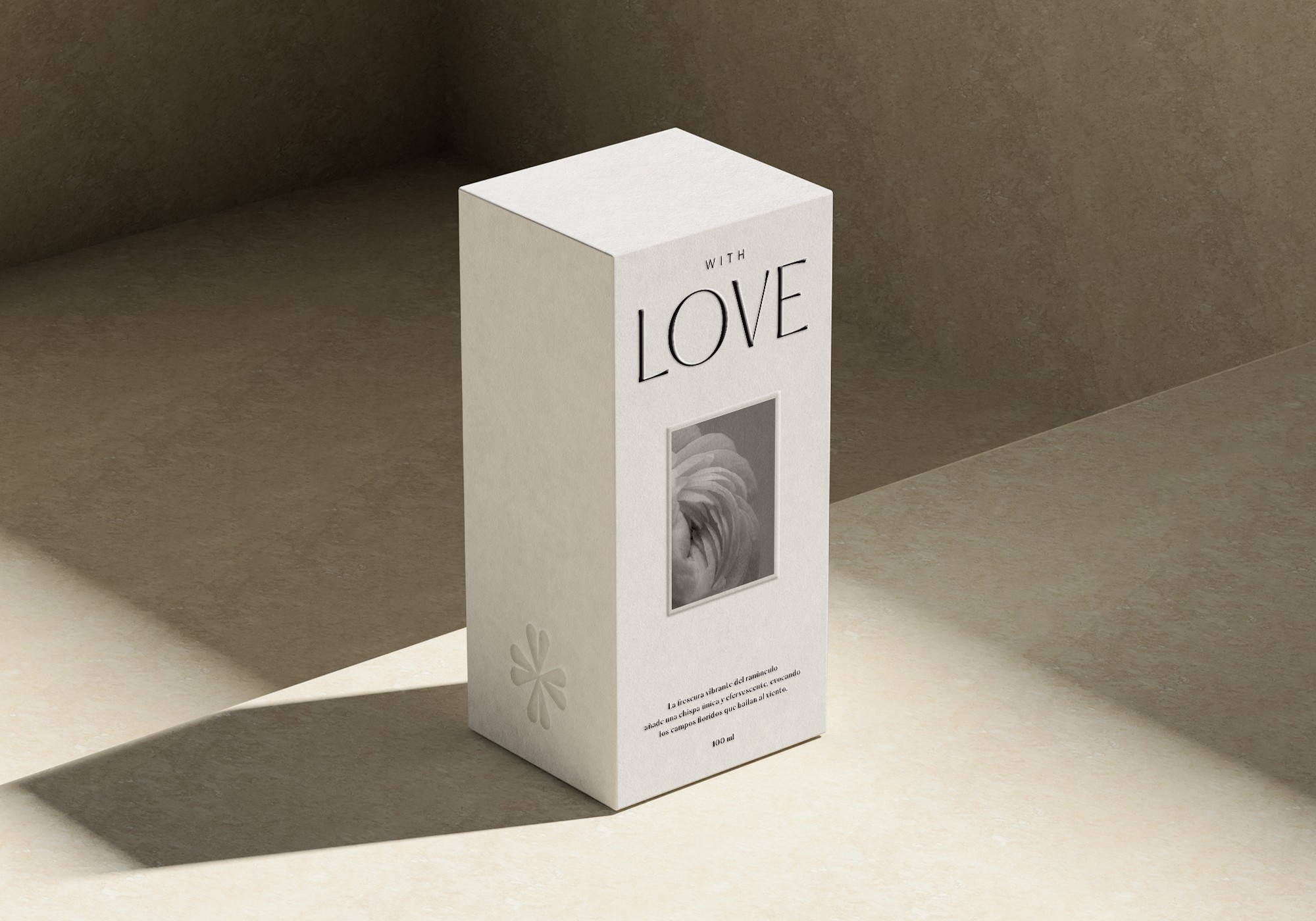
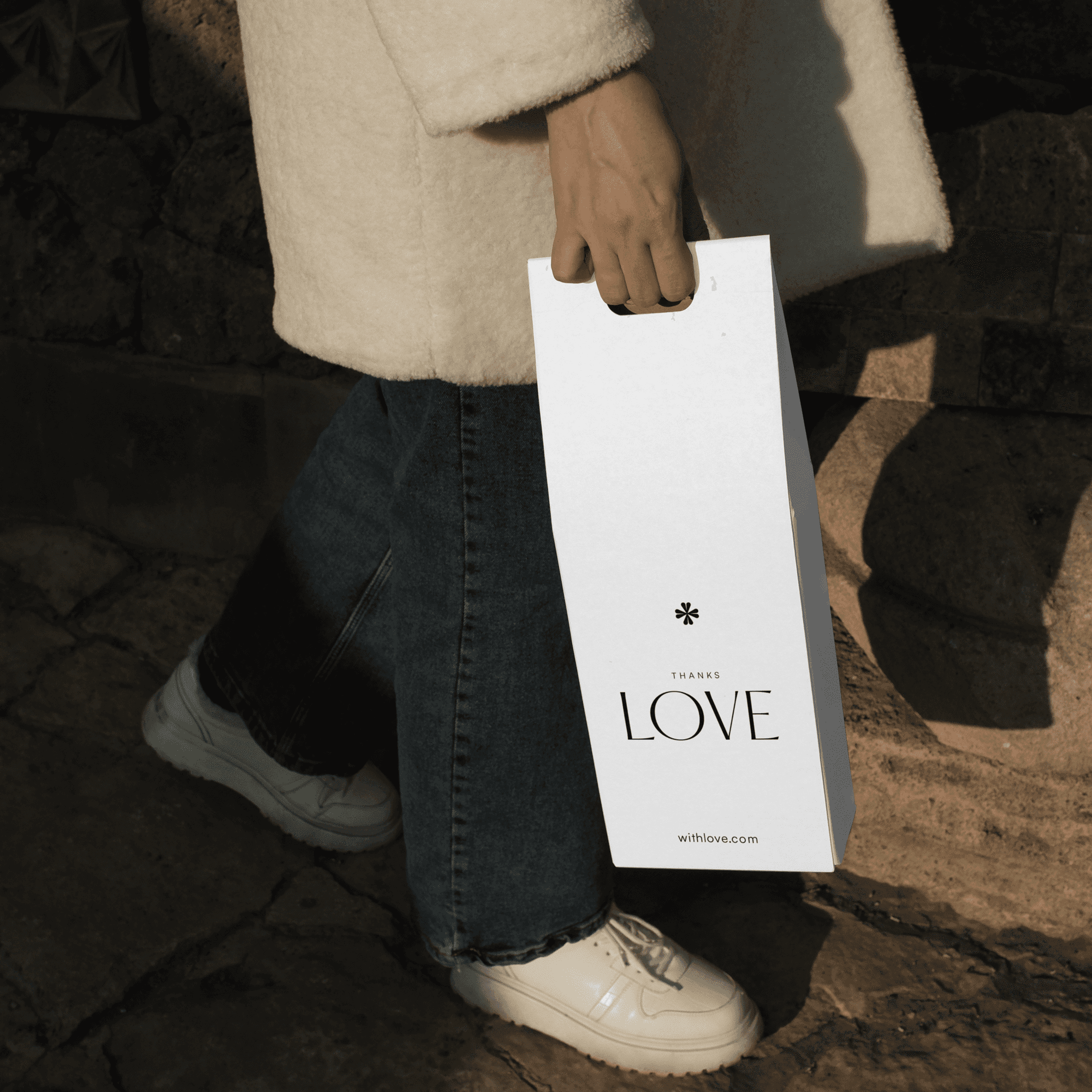
Shapes with LOVE
The LOVE logo begins with a sleek, sophisticated sans-serif typeface that balances bold personality with understated elegance. This approach creates a fresh, modern feel—youthful yet refined—setting it apart from competitors without compromising timeless sophistication. Central to the design is a subtle emblem representing love: a clean, organic, floral-inspired motif that embodies purity and emotional resonance. Designed for versatility, it integrates seamlessly across applications, avoiding visual clutter.
In my view, the excessive branding elements seen in many brands today risk alienating even loyal customers, often prompting a 'I love this, but…' hesitation. By prioritizing simplicity and restraint, LOVE’s identity fosters clarity and connection, rejecting the chaos of relentless ads, overcrowded visuals, and pressure-driven marketing.


Concept
Concept
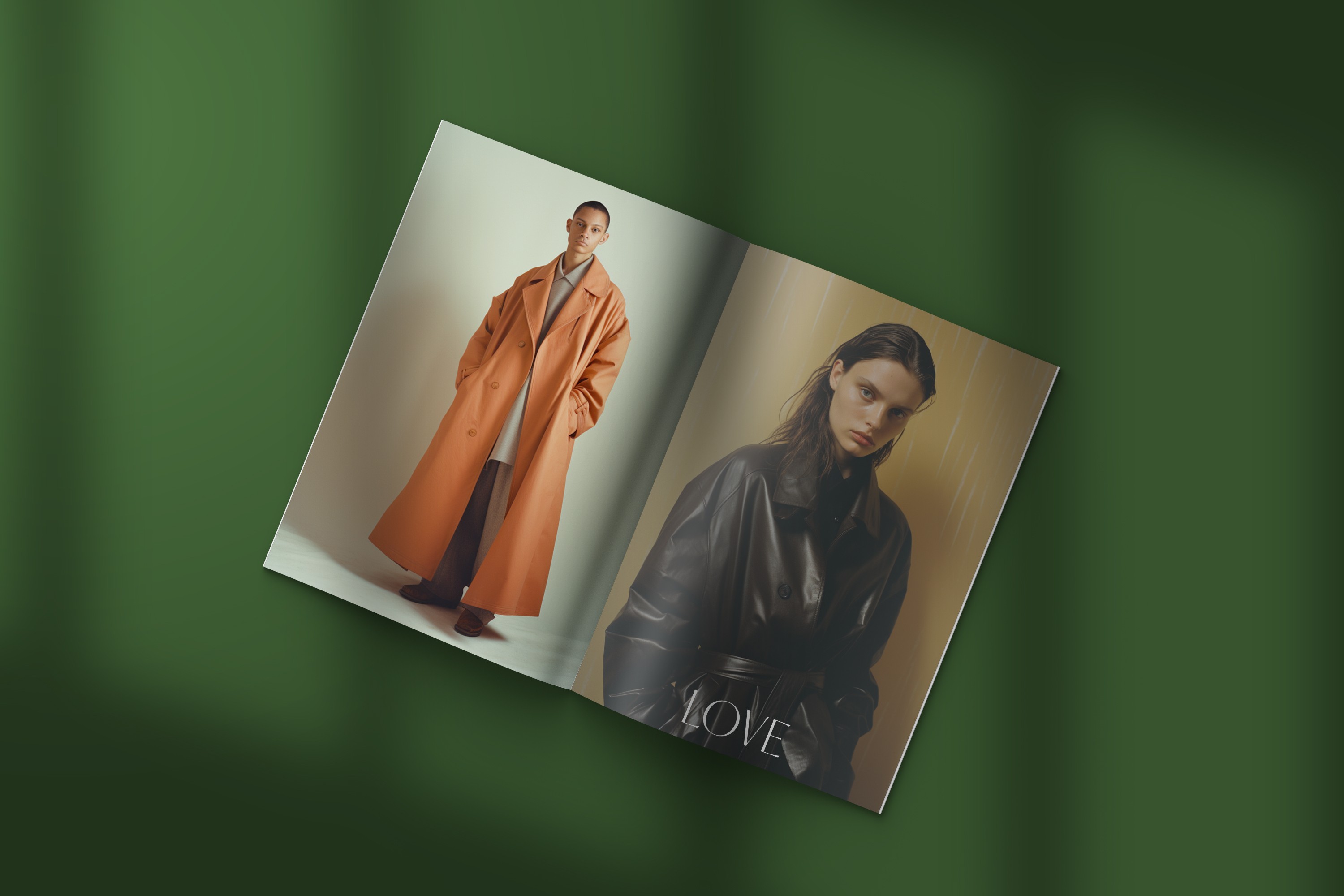
A Visual Language of Quiet Confidence
LOVE doesn’t shout to be seen—it invites you to feel. Its identity system leans on negative space, rhythm, and typographic elegance to cultivate trust without excess. Every visual decision is intentional, giving the brand room to breathe and the user space to connect—authentically, quietly, and without distraction.

More Works
More Works


LOVE
LOVE is a personal project that seeks to be a clean identity, close to be dreamlike, with symbolism and purity, it's made with love.
Branding
E-commerce
What
A minimalist design project fusing purity, symbolism, and dreamlike aesthetics
—crafted with heartfelt intention.
Why
LOVE emerges from the desire to craft a clean, elegant brand identity —minimalist in essence, yet intentional in spirit.
In an industry saturated with excess, noise, and mass-produced urgency, we aim to carve out space for a brand rooted in calm, clarity, and mindful consumption. Our focus is simplicity: helping you find what you need effortlessly, while staying conscious of both our environment and your well-being. No weekly newsletter spam, no ads bombarding your screens—just intentional design that respects your time and resists the pressure to buy what you don’t truly want.
Idea
Shapes with LOVE
The LOVE logo begins with a sleek, sophisticated sans-serif typeface that balances bold personality with understated elegance. This approach creates a fresh, modern feel—youthful yet refined—setting it apart from competitors without compromising timeless sophistication. Central to the design is a subtle emblem representing love: a clean, organic, floral-inspired motif that embodies purity and emotional resonance. Designed for versatility, it integrates seamlessly across applications, avoiding visual clutter.
In my view, the excessive branding elements seen in many brands today risk alienating even loyal customers, often prompting a 'I love this, but…' hesitation. By prioritizing simplicity and restraint, LOVE’s identity fosters clarity and connection, rejecting the chaos of relentless ads, overcrowded visuals, and pressure-driven marketing.
Concept
A Visual Language of Quiet Confidence
LOVE doesn’t shout to be seen—it invites you to feel. Its identity system leans on negative space, rhythm, and typographic elegance to cultivate trust without excess. Every visual decision is intentional, giving the brand room to breathe and the user space to connect—authentically, quietly, and without distraction.
More Works